How can you tell if a website is good vs bad? It’s a combination of the way they elements that we’ll discuss in detail.
Websites are essential if a business wishes to succeed. In fact, they’ve been essential for well over a decade now and most businesses, big and small, operate at least one website. Some even have several websites in the same industry but under different brands and marques to attract more business.
So what makes for a good website? As Houston’s premier web designing company, we know the answer. While we make fantastic websites, and will shamelessly advertise our own services if you’d like a custom-made website just for you, we also hope to share our perspective on what makes for a good website and what makes for a bad website.
What makes for a bad website?
To better understand what a good website looks like, let’s look at what it doesn’t look like. The distinction will help us better understand why a good website is critical to your business’ online strategy, and will help us answer the good website vs bad website question.
Old website
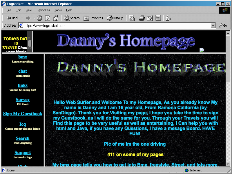
These are websites that look ancient. Someone made them in yesteryear, using technology from yester-decade. Often, they’re static websites. This means that updating and maintaining them is a hassle for a company, as they need someone who understands HTML, CSS and Javascript to maintain it and add content to it.

Static websites are bad for your search engine optimization (SEO). This is because static websites are meant for one specific screen size, and won’t resize on other devices. An old static website means it won’t look in many of the modern screens that people use, whether that’s on a PC, laptop, tablet or smartphone.
Newer static websites might look good on PCs and laptops but won’t look good on tablets or smartphones. With mobile browsing overtaking desktop browsing since 2016 and increasingly become more prevalent every passing day, Google and other search engines punish static websites because often, they’re not mobile friendly.
Bad UX/UI Design
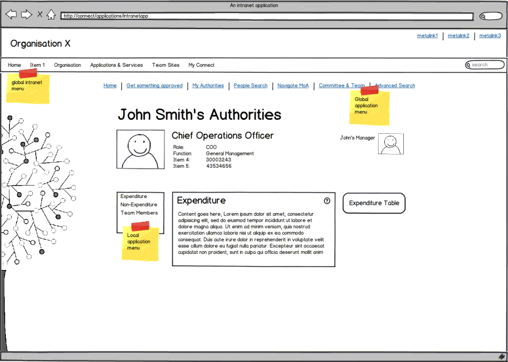
First, let’s define what UX and UI are. UX, also referred to as user experience, is the way a website is designed to allow for visitors to interact with the services and functionalities offered on the website. UI, also known as user interface, is how a website looks.
UX/UI are both two distinct design elements that need to be combined for a website to look and feel good for someone visiting it. A website may look gorgeous (good UI) but be hard to navigate and find what you’re after (bad UX). To make a good website, both UX and UI need not only to be great, but they also need to complement each other.

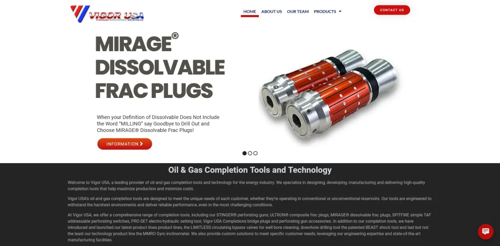
A good website looks stunning and easy to navigate. If it’s an eCommerce website, it needs to let visitors to easily find the good or service they’re looking for, find relevant reviews and easily purchase it.
What makes for a good website?
So far, we’ve looked at what makes for a bad website. Hopefully, you’ll see how some websites can be improved. Now, we’ll discuss what can we can add to turn an “okay website” to a “good website”, or even a “great website”. In this section, we’ll be able to finally answer the good vs bad website question we asked earlier on.
Search Engine Optimization Compatible
It is no longer enough to simply have a website to succeed online. To make the most of their online presence, businesses now contract search engine optimization (SEO) companies to do it for them. Speaking of which, here at triHead, we offer affordable SEO services.
If you’ve heard our previous blog post, you’ll see why SEO is so important. It’s important for businesses big and small. Even startups need them. Therefore, a good website supports SEO natively.
Besides a website being mobile friendly, as we’ve already discussed earlier in this blog post, they also need to support the ability to add focus key phrases, edit snippets and much more.
Web Application Security
Websites need to be secure. Older websites often come with old technologies that are outdated and no longer supported. That is to say, as new vulnerabilities are found, they don‘t get patched.

For example, Adobe is killing off Flash in 2020. While it’s 2019 and Flash is still seeing security updates, it is being phased out. Websites that still run Flash moving forward in 2020 will be vulnerable to being hacked. They can also make visitors less secure.
A good website will constantly rush to patch the extensions and services it offers to avoid cross-site scripting (XSS) attacks, and other vectors. By protecting its website, a company protects its reputation as well as its customers from malicious hackers.
Good use of media
A website that doesn’t make good use of images and videos is a bland websites. Websites need to draw visitors’ attention and keep it. This way, the visitor will want to navigate the website and read up more about what the company is all about and what it offers. Regardless of what your site is about, it needs to be interesting and it needs to have a great presentation. In short, media is an indicator of a good vs bad website.
Businesses that fail to capture visitors’ attention online tend to fail to capture their customers’ attention in their brick-and-mortar stores, too. Not being able to interest potential customers in your goods and services is bound to be disastrous. It’s essentially giving away your business to competitors who’ve implemented a better web design than your website has.

Media needs to be used sparingly and strategically. It’s important to realize that while the lack of media makes your site boring, supersaturating it with media won’t help either. In fact, it can be detrimental to you. Images and videos can make your website more pleasant to explore, but too much of it will be distracting and overwhelming. You should still aim to have a simple online portal to your business, after all.
Finally, it’s important to realize what form of digital media should be used at any given instance. Sometimes, a picture is more useful than a video. Other times, the opposite is true. Knowing when to use text, video, audio or even slideshows can be critical to sharing an idea or persuading a customer to shop with your business.
What makes a great website?
Now that we’ve covered the good vs bad website question, we can confidently explore this question for once and for all. By avoiding all the things that make a website bad, and incorporating what makes a good website, we get a great website.
A great website offers a great and well thought-out UX/UI experience; is mobile-friendly; actively supports SEO; makes good and strategic use of media formats; and is secure. But more than that, a great website constantly innovates and adapts to changes in the market and online. A great website regularly updates its existing content and adds new content, and primarily, doesn’t shy away from emerging technologies.

We make great websites
A great website is instantly recognizable because of the thought and effort put into it. You needn‘t be a web design expert to see it. And as Houston’s leading affordable web designer, we believe we should be your first choice.
We know different businesses and clients have different needs. Therefore, we offer different websites. Here at triHead, we consider your needs and suggest a web solution we think best suits your needs.
Whether you’re a startup needing a single-page website, a business that needs a multi-page website, or hoping to sell online, we’ve got you covered. And as we’re a search engine optimization (SEO) company, we know just how to design your website for a great SEO strategy. We also offer pay-per-click (PPC) advertising services on major online advertising platforms like Google and Facebook. Finally, we also offer social media engagement campaigns to help improve brand recognition on social media.


